Namshah
Alkharji
Peter
Smith
MA Design
for Communication
23rd
January 2014
Magnet Attracting Creativity
Brief:
As a
graphic design student few years ago, I felt disappointed by the fact that
Kuwait has nothing to inspire its students to study design. When I sought my
friends’ opinions on this matter, they agreed. The experience I just discussed
is from the year 2006 and I feel nothing has changed even after approximately
eight years.
It
suddenly occurred to me that instead of waiting for things to change, I should
take the matters into my own hands. This is why I am inspired to create a
platform that would support the creative but struggling designers in Kuwait. I
have designed a simple metaphoric scenario of a creative blue ball that turns
into a magnet. This scenario will help me explain why I have chosen this as my
RSA project.
The
creative ball that travelled through the streets of Kuwait was initially filled
with positive energy. But travelling through Kuwaiti streets turned her
positive energy into negative creative energy and the creative ball had to do
something about it and do it quickly. The creative ball then traveled to creative
and inspiring cities like New York, and London. The travelling experiences
inspired the creative ball and improved her creativity by hundred times. All
this newly-found creativity turned the creative ball into a magnet who now
wants to attract all the creative designers in Kuwait.
After
returning to Kuwait, the creative magnet ball once again travelled through the
streets. This time she found many creative people whose talent was being wasted
doing things that didn’t complement their true creative potential and/or
academic background. This gave the magnet ball an idea of collecting all these
creative people in one place. She rationalized that since opposites attract and
she is a positive charge, she should be able to attract all the creative people
currently occupied with negativity. Thus, she goes to them and gathers them
under one roof called MAGNET (attracting creativity).
Research:
For my
research I went to CAMPUS. Campus is a unique co-working space similar to my
RSA project. At Campus, you first enter
a reception area and then a small auditorium where educational talks take place.
The lower floor hosts a café where one finds all these talented and creative
people working while upper floors host co-working space for the members.
Campus
visit taught me a lot such as interior design and the overall concept behind the
campus. Their message is clear and their website is well-developed and
user-friendly. Visits to the campus helped me refine my own concept for MAGNET.
My first course of action was to come up with a name for my co-working space. My
first choice was THE ONE STOP but I didn’t like it so I presented the scenario to
my classmates and Professor Peter in classroom. Professor Peter pointed out I already
have a name in my scenario which is the magnet ball. I also browsed the website
www.coworkinglondon.com which lists co-working spaces in London. The
website also has an iPhone application which is quite helpful.
Design
concept:
The
purpose behind my project is to attract creativity. When people enter MAGNET, they enter a world of
creativity. This world of creativity provides them with a number of services such
as renting studio spaces, learning new techniques at workshops, access to
latest books on design, tutorials on the latest software in the lab, developing
photographs in the black room, attending exhibitions, printing design projects
in the print room, working outdoor at the plaza, they can also go to the plaza
where they can work outdoors, or simply enjoying a cup of coffee and meal at
the café. In short, MAGNET is a one-stop destination where designers have
everything they could possibly need.
Design
Development:
In the MAGNET’s
development stage, tasks were undertaken such as developing the MAGNET logo, rooms’
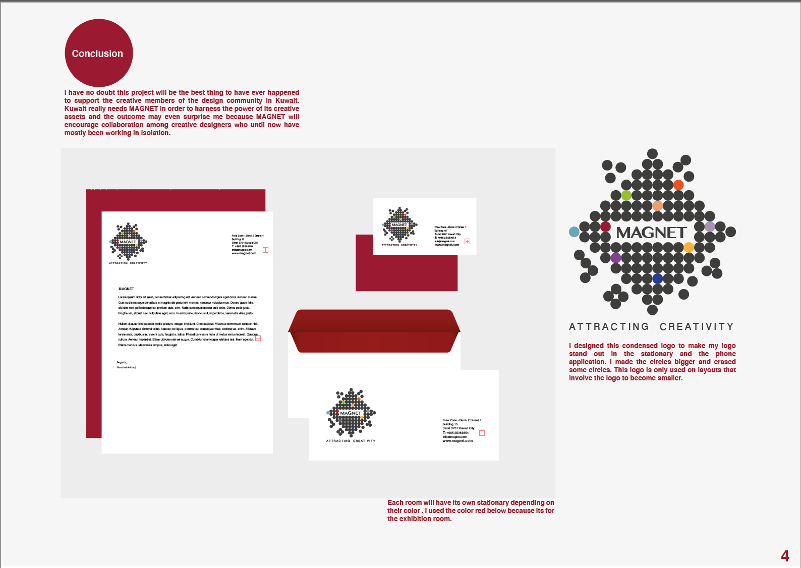
sub logos, website, phone app, stationary, and poster. I designed the logo which
depicts small gray circles attached to one another. This logo design represents
the MAGNET’s power of attraction and the nine different colors in the logo
represent the nine rooms inside the MAGNET.
There are some gray circles that are not attached because they represent
movement. These circles represent
creative people who are entering MAGNET or are already inside it. When one
looks at the circles as a group, one notices that these circles together form a
shape of the square which represents the building. The typeface for the word ‘MAGNET’
is Oriya MN while the typeface for the rooms is Oriya Sangam MN.
The website, phone app, and
posters depict the same logo to ensure uniformity, simplicity, and clarity. I have
categorized each room by a specific color.
1.
The first room is the exhibition room and is
represented by the color red.
2.
The second room is the library and is
represented by the color light purple.
3.
The third room is the plaza and is represented
by the color green.
4.
The fourth room is the café and is represented
by the color beige.
5.
The fifth room is the studio and is represented
by the color orange.
6.
The sixth room is the workshop and is
represented by the color yellow.
7.
The seventh room is the lab and is represented
by the color blue.
8.
The eighth room is the printing and is represented
by the color navy blue.
9.
The ninth is the black room and is represented
by the color dark purple.
MAGNET
is divided into two zones which are the public zone and the private zone. The
public zone includes the exhibition, café, and the bookstore while the private
zone is strictly reserved for members and includes the library, studio room, workshop,
printing area, black room, social room, and the computer lab.
Design
Evaluation:
MAGNET
is a co-working space that will be greatly beneficial to the Kuwaiti society. MAGNET
will help creative people who are struggling and ensure their talent and
potential doesn’t go to waste. I have really enjoyed this project because it
reflects my desire and I have a personal stake in it, being one of the creative
people who struggle in Kuwaiti society. One of the challenging tasks in the
project was designing the logo because I wanted it to be simple, communicative,
and memorable. Steve Jobs aptly pointed out, “Simple
can be harder than complex; you have to work hard to get your thinking clean to
make it simple. But it’s worth it in the end because once you get there, you
can move mountains.”
If I had more time I would have loved to bring more life into this
project. Some of the initiatives might have been design the building in 3D, designing
membership applications forms, and developing a payment system for MAGNET
members.
This project has helped me become a better designer and has also
improved my attention to details. I have learnt that even the smallest details
sometimes make a huge difference. This project has also increased my
self-confidence that with determination, hard work, and perseverance, nothing
is impossible.
Conclusion:
I have no doubt this project will be the best thing to have ever
happened to support the creative members of the design community in Kuwait.
Kuwait really needs MAGNET in order to harness the power of its creative assets
and the outcome may even surprise me because MAGNET will encourage
collaboration among creative designers who until now have mostly been working
in isolation.
Works Cited
Airey,
David. Logo Design Love. California, New Riders, 2010.
Campus London. Campus. 11 January 2014
<http://www.campuslondon.com/>.
CoWorking London. CoWorking London – a directory of
London coworking spaces. 11 January 2014
<http://www.coworkinglondon.com>.
Johnson,
Michael. Problem Solved. New York, Phaidon Press Inc, 2002.
McAlhone,
Beryl & Stuart, David. A smile in the mind. New York, Phaidon
Press Inc, 1996