Tuesday, January 28, 2014

Environmental Sign System (Task 2)

Science Museum sign System


Introduction:

The environmental sign system is essentially a visual and graphical representation of signs and symbols intended as a fundamental and direct facilitator of human interaction in a public place. Heavily dependent on thorough environmental graphic designs, this system can be employed with effectiveness in way finding especially in healthcare facilities, libraries, museums, roads and stores. A sing system exists one can know where he/she is in a building or environment and how to get to an appropriate location from their present location. 

concept innovation:

THE FONT:


"After experimenting with several routes, the chosen idea stemmed from research we did on codes, puzzles, patterns and basic digital typefaces, and we found a way to shorten the word science so we could create a grid-like ‘stack' of the letterforms. We also began to experiment with slightly abstracted letterforms as we noticed that ‘science' and ‘museum' were relatively generic words."-Johnson

Taking you through the museum:
When you enter the science museum the first thing you'll see is the welcome sign, a digital screen to brief whats on, as well as a sign to thank the whole team for the support and hard effort.


I went to the information desk later on for the guide map of the museum. The sign system of the information desk looks like the picture below.


The map guide was very helpful. when you first look at the map
you'll see that each floor is color coded. 


The Ground floor is red:


The lower ground floor is pink:

As you can see at picture above the map key which explain all the icons in the map. All those icons are part of the sign system.


The stairs of the lower ground floor as you can see they don't have the color pink here.


They don't use the same font here


The first floor is purple:


The second floor is turquoise:


The third floor is orange:


The fourth floor is lime green:


The fifth floor is grey or light brown:


The concept of the design museum is color coded as you can see. Every floor has its own color. what I really found helpful is the map guide. In the map they use letters and numbers from the same font of the logo, which I find very intersting. They also use the font of the logo for sign system as you can see below and banners for advertising. Every floor has a digital screen describing the highlight of that specific floor except the lower ground floor, the fourth floor and the fifth floor.

Outside the museum:


as you can can see they all use the same layout design for the banners, its well-ordered.

Inside the museum:


strengths and weaknesses:
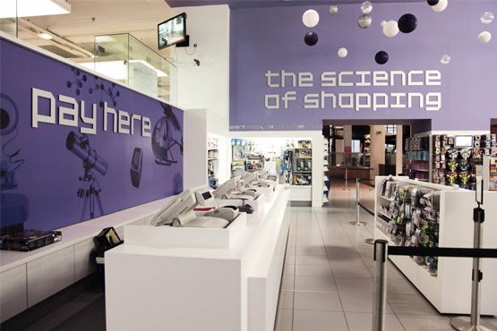
The strength part of the science museum is the use of the same logo font. I find it a very strong sign system they even use it in the shop, and the language they use it grabs your attention. For example: the science of shopping.


inside the elevator:


The weakness part which i found very disappointing  is when i wanted to go to the 4th and 5th floor it was so hard for me to navigate through the museum it was not clear in the map I had to ask a lady to guide me. To go to the 4th and 5th floor i needed to change elevators. 

In conclusion The innovation of any concepts of an environmental sign system generally focuses on the principles that go into way finding. These principles normally include architectural signs, lighting, signage and sight lines.  This is fundamental because users of any sign system rely on these principles when deciding how to reach their destination. The most successful concept in any way finding system indicates on where the user is, and how to reach their destination. 


Design: johnson banks (http://johnsonbanks.co.uk)
Designers: Michael Johnson, Kath Tudball, Miho Aishima


References:http://johnsonbanks.co.uk/exhibitions-and-3d/science-museum-signage/
http://www.creativereview.co.uk/cr-blog/2010/june/science-museum-identity
http://books.google.co.uk/books?hl=en&lr=&id=ZsaTyz3HgwcC&oi=fnd&pg=PP12&dq=Berger,+C.+(2009).+Wayfinding:&ots=W2li3CrTsK&sig=N-F8WsKt8S2LJxiZ6kNcEJvgMUM#v=onepage&q&f=false

Typeface (Task 1)

A design can be made or be broken by the choice of typeface. For over a century now, various designers have found typeface to be quite significant because the well thought-out forms of history are greatly amazing. 

Futura:
Futura is one of the greatest typefaces which still has equal importance as it had when it was first created about 90 years ago. The designers of this typeface were in the look-out for just a “good” design that was and still is, visually appealing coupled with ability to be applied in a highly efficient society. The Futura font was create in 1927 by Paul Renner. Largely influenced by the Bauhaus design school, he came up with a typeface that had no elements of ornamentation and lacked personal characteristics. Because of this, it had pure functionality. The font is highly based on basic shapes of circles, squares and triangles. These elements improve its readability which contributes extremely  to fulfill its purpose. The Futura font is characterized by lower case letters that arise above their capital ones, strokes that have almost even weight.


 It is highly efficient in a number of ways. It is readable, standard, clean and highly stylish and lacks style. These characteristics have made most manufacturers and companies to create iconic effects by applying it. Among these companies are IKEA and Volkswagen.


It is also used in film, The Life Aquatic with Steve Zissou. 


The only weakness of this future font is that the width of letters such as j is very small compared to letters O and W. This makes the font to fail balance when applied in writing long banners.


Garamond:
On the other hand, Garamond is widely used today and is a design that was originally made during the 16th century. The original designer is Claude Garamond’s Janon. The font is greatly readable, a trait which has enhanced its application for centuries. Since it is considered to be one the oldest typefaces, it carries with it a solid sense of tradition. It prides itself to softness, attractiveness and rounded serifs that are elegant. It is also characterized by strokes that are diagonally emphasized. Several other aspects of the font like kerning, line spacing make font proportions and respective presentation to rhyme in the face of the reader. The small eye of e and equally small eye of a are some of the unique characteristics of the font.


 On the other hand, the top serifs and long extenders exhibit a downward slope. The font is suitable for offline applications like print and has the advantage of being highly eco-friendly since when used in printing; it highly economizes on ink usage. However, Garamond faces a major hurdle in the face of modern display technologies. It can’t be appropriate for web copy.


The development of Garamond:
  • Garamond Monotype designed by Max Steltzer (1922)
  • Garamond Stempel designed by Stempel (1924)
  • Garamond Simoncini designed by Francesco Simoncini (1958)
  • Garamond ITC (International Typeface Corp) designed by Tony    Stan's (1970)
  • Adobe Garamond designed by Robert Slimbach (1988)
  • Garamond Berthold designed by Berthol

Different Traces of the G :


Different Versions of the Garamond:


References: 
http://idsgn.org/posts/know-your-type-futura/
http://barneycarroll.com/garamond.htm
http://en.wikipedia.org/wiki/Garamond
http://en.wikipedia.org/wiki/Futura_(typeface)


Monday, January 20, 2014

Magnet (700-100 words)

Namshah Alkharji
Peter Smith
MA Design for Communication
23rd January 2014
Magnet Attracting Creativity
Brief:
As a graphic design student few years ago, I felt disappointed by the fact that Kuwait has nothing to inspire its students to study design. When I sought my friends’ opinions on this matter, they agreed. The experience I just discussed is from the year 2006 and I feel nothing has changed even after approximately eight years.
It suddenly occurred to me that instead of waiting for things to change, I should take the matters into my own hands. This is why I am inspired to create a platform that would support the creative but struggling designers in Kuwait. I have designed a simple metaphoric scenario of a creative blue ball that turns into a magnet. This scenario will help me explain why I have chosen this as my RSA project.
The creative ball that travelled through the streets of Kuwait was initially filled with positive energy. But travelling through Kuwaiti streets turned her positive energy into negative creative energy and the creative ball had to do something about it and do it quickly. The creative ball then traveled to creative and inspiring cities like New York, and London. The travelling experiences inspired the creative ball and improved her creativity by hundred times. All this newly-found creativity turned the creative ball into a magnet who now wants to attract all the creative designers in Kuwait. 
After returning to Kuwait, the creative magnet ball once again travelled through the streets. This time she found many creative people whose talent was being wasted doing things that didn’t complement their true creative potential and/or academic background. This gave the magnet ball an idea of collecting all these creative people in one place. She rationalized that since opposites attract and she is a positive charge, she should be able to attract all the creative people currently occupied with negativity. Thus, she goes to them and gathers them under one roof called MAGNET (attracting creativity).
Research:
For my research I went to CAMPUS. Campus is a unique co-working space similar to my RSA project.  At Campus, you first enter a reception area and then a small auditorium where educational talks take place. The lower floor hosts a café where one finds all these talented and creative people working while upper floors host co-working space for the members.
Campus visit taught me a lot such as interior design and the overall concept behind the campus. Their message is clear and their website is well-developed and user-friendly. Visits to the campus helped me refine my own concept for MAGNET. My first course of action was to come up with a name for my co-working space. My first choice was THE ONE STOP but I didn’t like it so I presented the scenario to my classmates and Professor Peter in classroom. Professor Peter pointed out I already have a name in my scenario which is the magnet ball. I also browsed the website www.coworkinglondon.com  which lists co-working spaces in London. The website also has an iPhone application which is quite helpful.
Design concept:
The purpose behind my project is to attract creativity.  When people enter MAGNET, they enter a world of creativity. This world of creativity provides them with a number of services such as renting studio spaces, learning new techniques at workshops, access to latest books on design, tutorials on the latest software in the lab, developing photographs in the black room, attending exhibitions, printing design projects in the print room, working outdoor at the plaza, they can also go to the plaza where they can work outdoors, or simply enjoying a cup of coffee and meal at the café. In short, MAGNET is a one-stop destination where designers have everything they could possibly need.
Design Development:
In the MAGNET’s development stage, tasks were undertaken such as developing the MAGNET logo, rooms’ sub logos, website, phone app, stationary, and poster. I designed the logo which depicts small gray circles attached to one another. This logo design represents the MAGNET’s power of attraction and the nine different colors in the logo represent the nine rooms inside the MAGNET.  There are some gray circles that are not attached because they represent movement.  These circles represent creative people who are entering MAGNET or are already inside it. When one looks at the circles as a group, one notices that these circles together form a shape of the square which represents the building. The typeface for the word ‘MAGNET’ is Oriya MN while the typeface for the rooms is Oriya Sangam MN.
The website, phone app, and posters depict the same logo to ensure uniformity, simplicity, and clarity. I have categorized each room by a specific color.
1.     The first room is the exhibition room and is represented by the color red.
2.     The second room is the library and is represented by the color light purple.
3.     The third room is the plaza and is represented by the color green.
4.     The fourth room is the café and is represented by the color beige.
5.     The fifth room is the studio and is represented by the color orange.
6.     The sixth room is the workshop and is represented by the color yellow.
7.     The seventh room is the lab and is represented by the color blue.
8.     The eighth room is the printing and is represented by the color navy blue.
9.     The ninth is the black room and is represented by the color dark purple.

MAGNET is divided into two zones which are the public zone and the private zone. The public zone includes the exhibition, café, and the bookstore while the private zone is strictly reserved for members and includes the library, studio room, workshop, printing area, black room, social room, and the computer lab.
Design Evaluation:
MAGNET is a co-working space that will be greatly beneficial to the Kuwaiti society. MAGNET will help creative people who are struggling and ensure their talent and potential doesn’t go to waste. I have really enjoyed this project because it reflects my desire and I have a personal stake in it, being one of the creative people who struggle in Kuwaiti society. One of the challenging tasks in the project was designing the logo because I wanted it to be simple, communicative, and memorable. Steve Jobs aptly pointed out, “Simple can be harder than complex; you have to work hard to get your thinking clean to make it simple. But it’s worth it in the end because once you get there, you can move mountains.”

If I had more time I would have loved to bring more life into this project. Some of the initiatives might have been design the building in 3D, designing membership applications forms, and developing a payment system for MAGNET members.
This project has helped me become a better designer and has also improved my attention to details. I have learnt that even the smallest details sometimes make a huge difference. This project has also increased my self-confidence that with determination, hard work, and perseverance, nothing is impossible.
Conclusion:
I have no doubt this project will be the best thing to have ever happened to support the creative members of the design community in Kuwait. Kuwait really needs MAGNET in order to harness the power of its creative assets and the outcome may even surprise me because MAGNET will encourage collaboration among creative designers who until now have mostly been working in isolation.


Works Cited


Airey, David. Logo Design Love. California, New Riders, 2010.
Campus London. Campus. 11 January 2014 <http://www.campuslondon.com/>.
CoWorking London. CoWorking London – a directory of London coworking spaces. 11 January 2014 <http://www.coworkinglondon.com>.
Johnson, Michael. Problem Solved. New York, Phaidon Press Inc, 2002.
McAlhone, Beryl & Stuart, David. A smile in the mind. New York, Phaidon Press Inc, 1996